It's easy to hire any freelancer, but it’s tough hiring quality freelancers. AVA aims to bridge this gap by providing an end-to-end platform that makes the process of hiring quality freelancers a seamless one.
Our team of 5 redesigned the offline state and onboarding sign-up experience of the existing website. The revised design, through usability testings, had a 10% increase in score (based on our own defined scoring matrix).
Our team of 5 redesigned the offline state and onboarding sign-up experience of the existing website. The revised design, through usability testings, had a 10% increase in score (based on our own defined scoring matrix).
︎︎︎ Team of 5 members
Role and significant contributions:
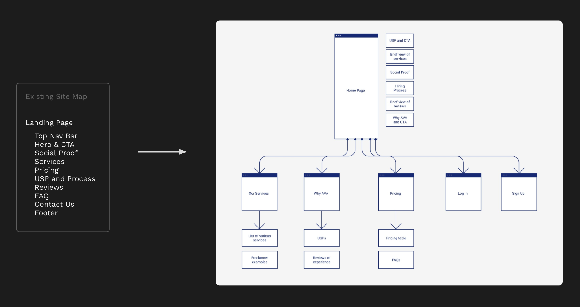
︎︎︎ Redesigned information architecture, site map, user flow
︎︎︎ Redesigned the client’s logo
︎︎︎ Designed the entire design style guide with a component-based approach
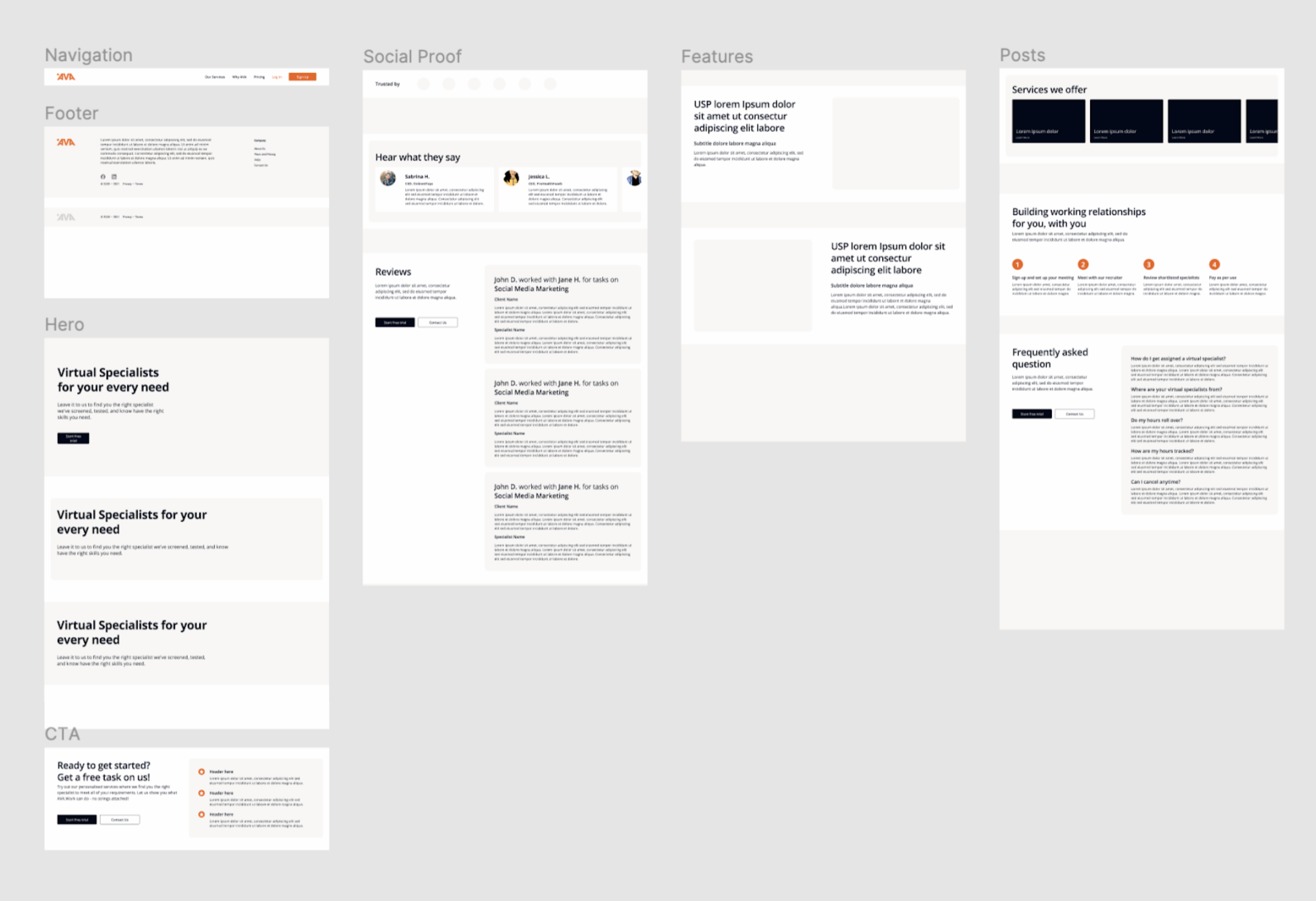
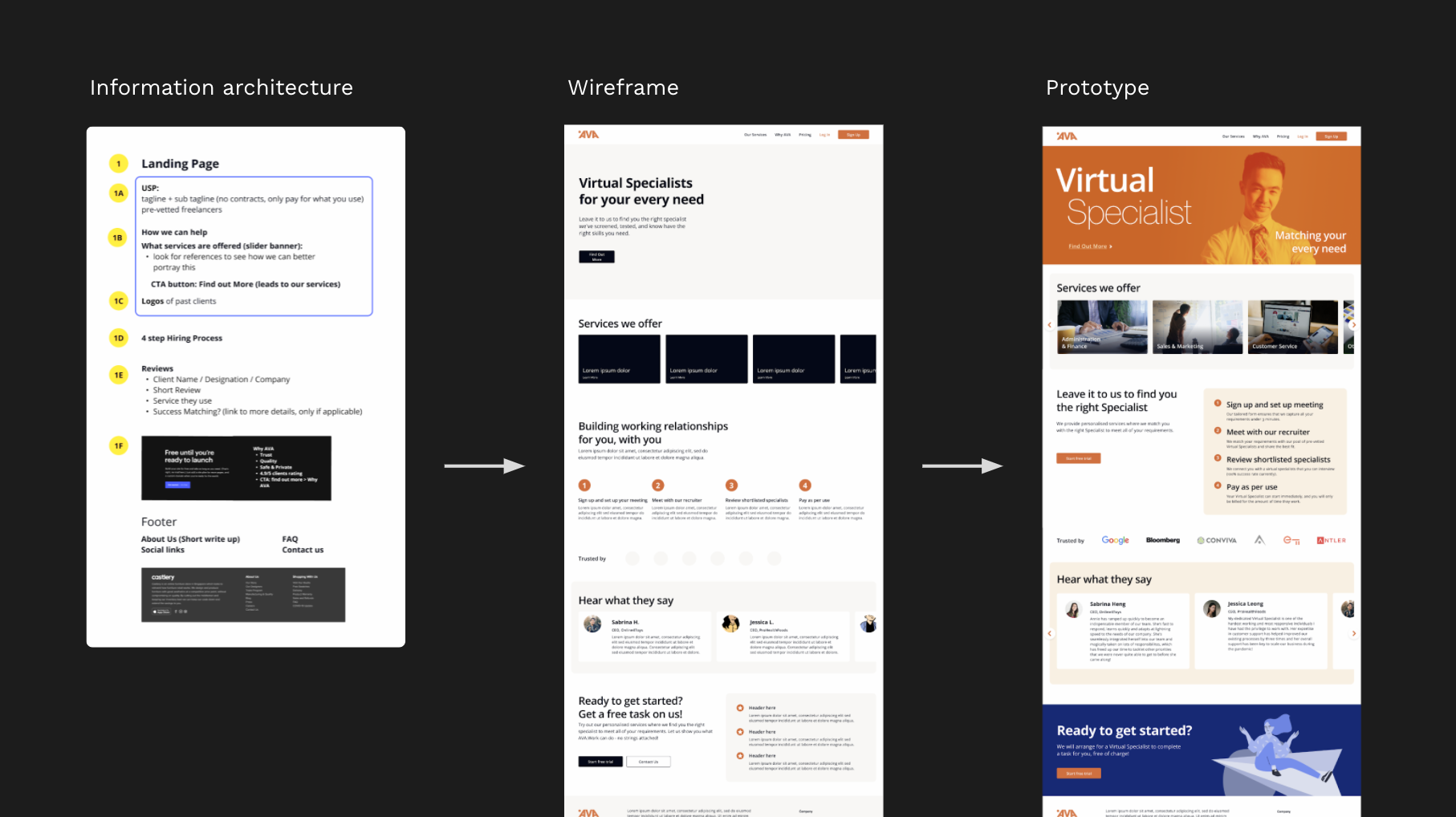
︎︎︎ Designed the prototype wireframes through to the final pages with Figma
︎︎︎ Redesigned the sign-up flow and form
︎︎︎ Client presentation content and design
Role and significant contributions:
︎︎︎ Redesigned information architecture, site map, user flow
︎︎︎ Redesigned the client’s logo
︎︎︎ Designed the entire design style guide with a component-based approach
︎︎︎ Designed the prototype wireframes through to the final pages with Figma
︎︎︎ Redesigned the sign-up flow and form
︎︎︎ Client presentation content and design
Project brief and challenges
︎︎︎ AVA has an existing, untested website
︎︎︎ Hoping to shift the onboarding process online, instead of the current process of manually reaching out on linkedin
︎︎︎ Reduce online sign-up drop off rate
︎︎︎ Hoping to shift the onboarding process online, instead of the current process of manually reaching out on linkedin
︎︎︎ Reduce online sign-up drop off rate
Identifying the issues
Research methodsTo evaluate the different pain points, concerns, and priorities when it comes to sourcing and hiring a virtual assistant, and also with the existing AVA website. Heuristic evaluation was done on the existing website, along with competitive analysis, and user interviews.
We synthesised our findings and identified 6 main issues, these guided us on which aspects of the website to look into, and the informed the eventual design decisions.
We synthesised our findings and identified 6 main issues, these guided us on which aspects of the website to look into, and the informed the eventual design decisions.


Opportunity for a rebrand
OpportunitySince the existing brand and website didn’t have a consistent brand positioning and visual identity, I went ahead to redefine the AVA branding and logo.
The new AVA logo was designed to represent the role that it plays in the clients’ companies: providing the foundation that every company needs for them to achieve the best that they can. This is liken to the base of a mountain, stable and strong, that allows one to scale to greater heights with confidence.
We also redefined the style guide to match AVA’s revised brand positioning. Complimentary colours of orange and blue were chosen to show that AVA is both inviting, warm, joyful to use, and at the same time, trustworthy, dependable and commited to its users.
With an expanded style guide and components for the webpage, we went ahead to redesign the webpages to address the other issues.


Tackling the 6 identified issues
Opportunity for a rebrandWe also redefined the style guide to match AVA’s revised brand positioning. Complimentary colours of orange and blue were chosen to show that AVA is both inviting, warm, joyful to use, and at the same time, trustworthy, dependable and commited to its users.
With an expanded style guide and components for the webpage, we went ahead to redesign the webpages to address the other issues.
With an expanded style guide and components for the webpage, we went ahead to redesign the webpages to address the other issues.
① Reducing page length
Identified issueWebpage is too long, too much information at a glance, not sure where to look first
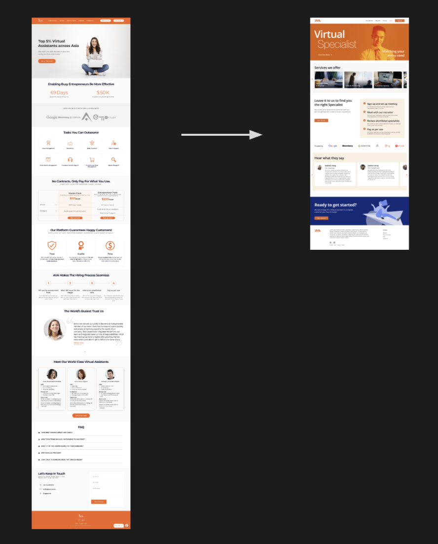
OpportunityThe existing website is one long-scroll page. This reduces the effectiveness of SEO and is not efficient in guiding people to the information they need.
We reconsidered the information architecture and revamped the site map. The final designed page length was reduced to about 50% of the existing version. This helps users to not be bombarded with so much irrelevant information all at once.
② Redesign tagline/hero
③ To reconsider the term ‘Virtual Assistant’
Identified issuesHero tagline doesn’t speak to the users
“I’m not really understanding the tagline? What does it mean? Is the free task referring to me getting a free task or am I doing the free task?”
Services offered by AVA does not match users’ understanding of a Virtual Assistant “I see virtual assistants as people doing admin tasks, not too sure if they can offer the services that I need.”
OpportunityThrough our user interviews, we found out that most of the users didn’t understand the business’ tagline and unique selling point (USP).
The website was lacking a clear tagline. We rearranged what users would see on the hero as well as above the fold of the webpage, so that it might give them a clearer idea of the business.


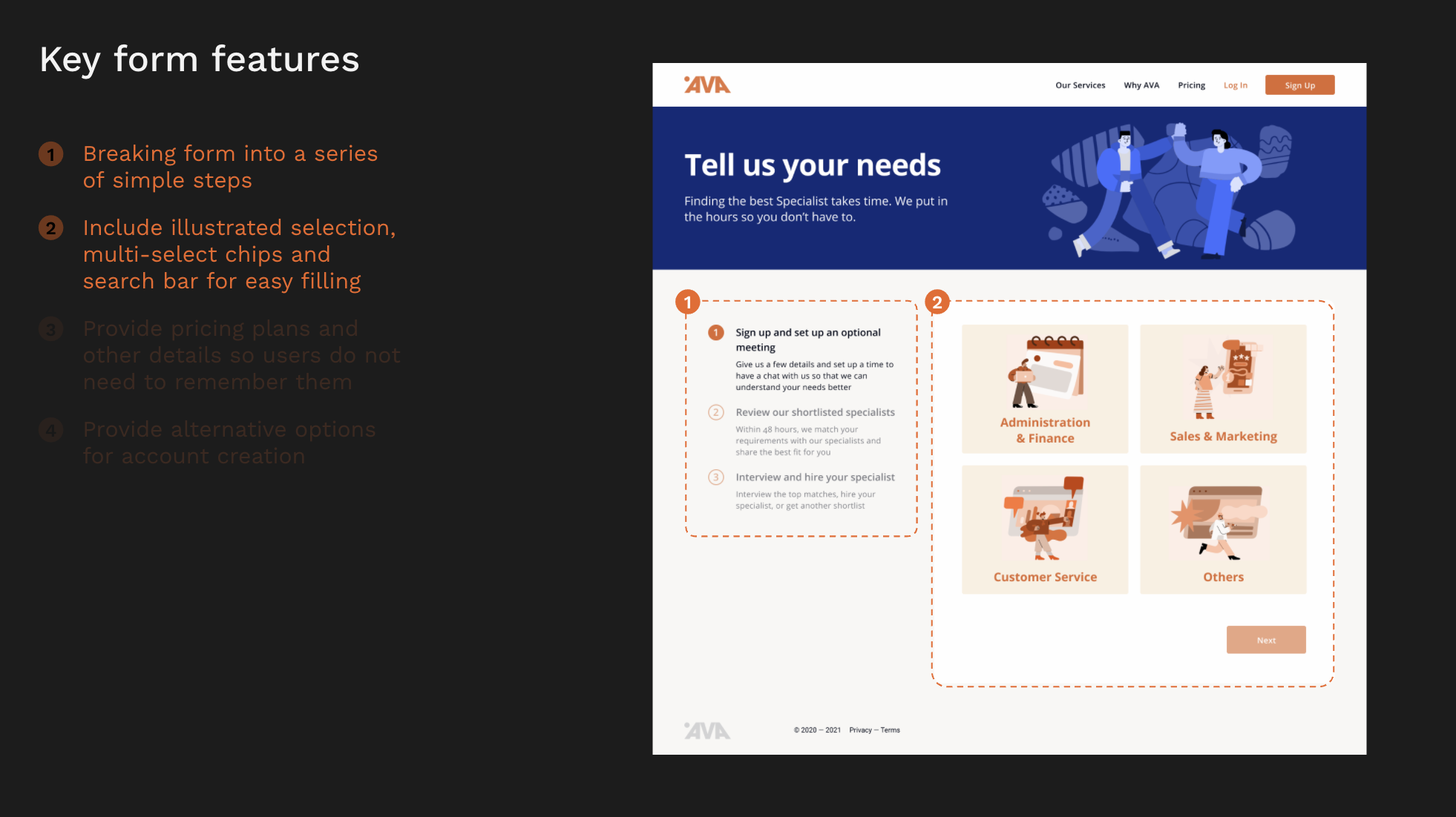
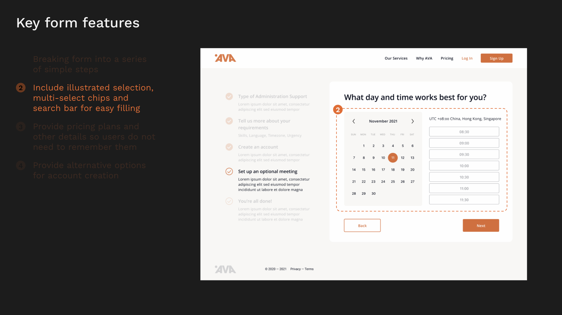
④ Redesign the sign up process
Identified issuesSign up form does not look credible
“I will not use the sign up form. It looks a little like a survey form at the moment. I also will not give my email details at the start, only at the end. If they ask for it first, I might just skip this website. I only give details after I am really keen.”
There were two design considerations that I kept in mind for the sign-up form, which also resulted in a few of the key form features in the final design.
︎︎︎ A lot of information is needed by the business, so how can the design make it succinct and easy for users to fill up?
︎︎︎ Needs to be visually intuitive for users to get the information they need / know their progress


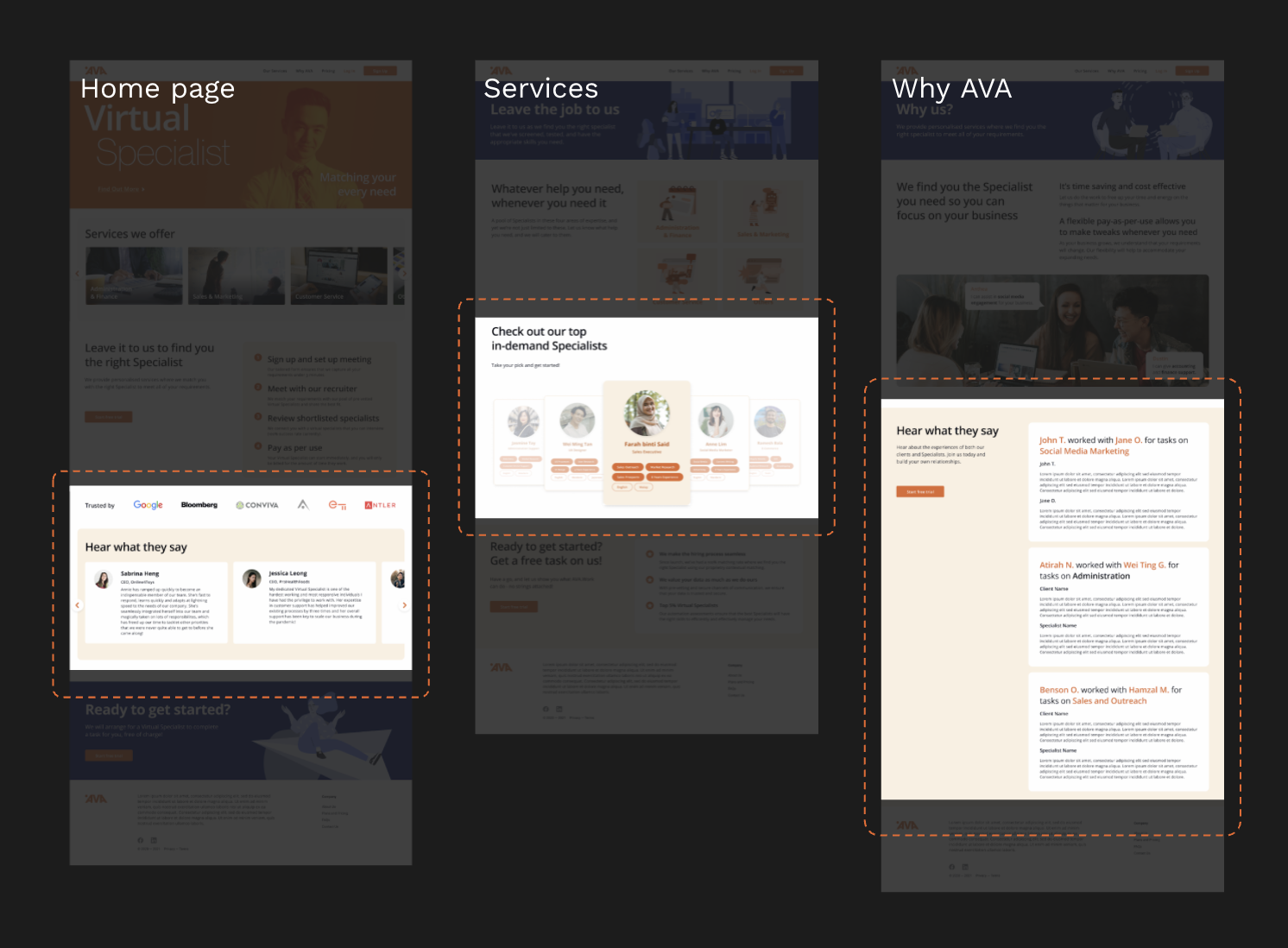
⑤ Add validation content
Not enough content or reviews to validate quality
“Reviews and recommendations matter a lot. Recommendations help me to curate.”
Throughout the website, testimonials, reviews and profiles cards of top specialists were included to further validate the site and service. Longer articles such as case studies were also considered for future implementation.
Throughout the website, testimonials, reviews and profiles cards of top specialists were included to further validate the site and service. Longer articles such as case studies were also considered for future implementation.
Steps forward, challenges and other limitations
The last identified issue Most enjoy that they are able to search and filter the freelancers for their needs
“I want to be able to search and see the profiles of the freelancers.”
We deemed this a brand positioning issue for the company’s reconsideration. Through our usability testings, we also found that most of our interviewees had a preconceived idea of what a freelance-providing website should be and function.
Because of this, they were unable to grasp quickly that AVA is not a service that allows them search for freelancers on their own. To prevent users from pre-judging the AVA site, the brand positioning and campaigning needs to be clearer and stronger to show that the business is not a freelance platform that is just like its competitors, such as fiverr and upwork.
A few limitations and challenges faced: Our short time frame left a lot of areas untested; information architecture, image / illustration style There was a lack of usable content for a realistic prototype and design, however this is typical of any design process.
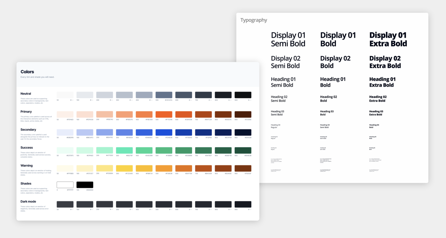
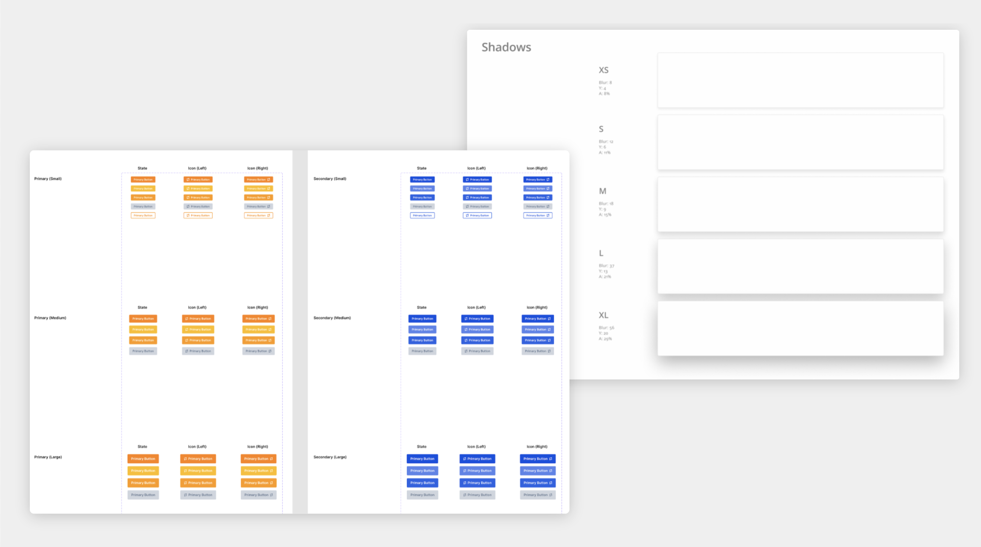
Revised style guide V2
After the project ended, I made further refinements to the style guide to improve it.
Project info
This project was done during my time at CuriousCore (Oct 2021 – Jan 2022) and was my first UX project during the course. The project gave me a lot to think about in terms of validating design decisions through quantifiable means, in ways that graphic design might not have needed!
And a special thanks to my teammates:
Pasmine, Christina, El, Benjamin
Pasmine, Christina, El, Benjamin