How do we create community touch points so that we can facilitate more active engagement between users, and with the brand?
AirAsia wanted to build a community within their brand. The task was to find out what ideas of community the super app could entail, and the corresponding features that can be designed to promote it. The project was still in discovery phase, so it was an open brief.
Our team eventually structured an emotional value proposition, proposed a plausible product vision that focuses on emotions, rather than utility. We looked into the leading intrinsic motivations and values for users and designed an overarching UX strategy to align the user experience with the business goals of the consequent community features.
Our hypothesis is that an increase in app engagment through the community features will promote user retention, and eventually, lead to a higher sale conversion.
︎︎︎ Team of 4 members
Role
︎︎︎ Defining the research process
︎︎︎ Synthesizing research and data into strategy forming
︎︎︎ Translating key value principles into tangible features
︎︎︎Client presentation content, flow and design
After the project, I revisited and tweaked the initial ideas to see how I could improve them, and also designed the screens on figma.
Research and strategy forming
The first step was to narrow the scope of the project. We first begin the research with understanding the need for a community. Why do businesses need a community? Why do people join a community?
The Why: Understand our users’ motivations for coming together in a communityThe What:Identify what people expect from being in a communityThe How:Narrow down the tangible features to focus on within the super app
We came up with a plausible product vision that focuses on emotions, rather than utility, based on the leading intrinsic motivations of users. The overarching UX strategy also helped align the user experience with the business goals of the consequent design of community features.
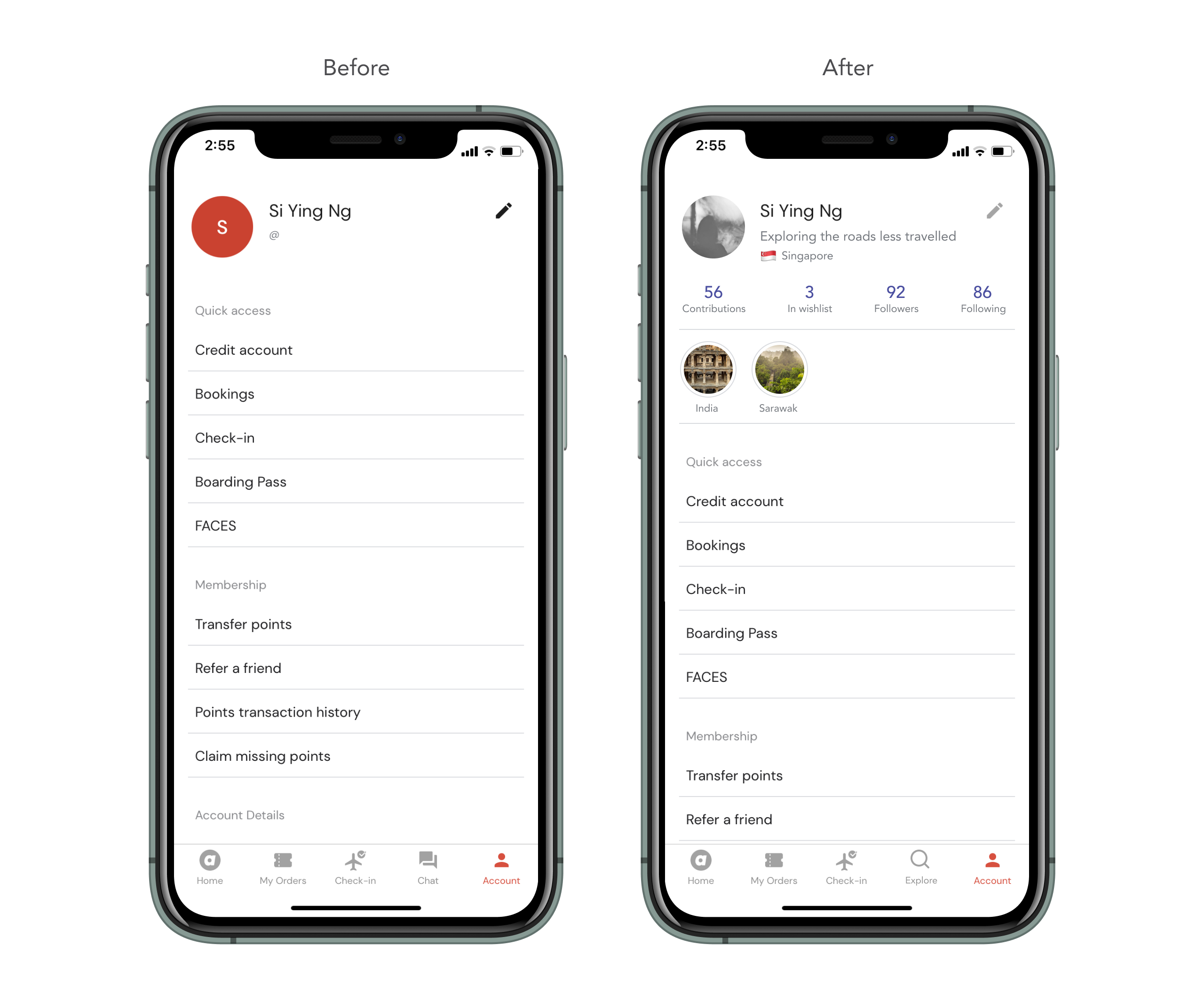
The best of both worlds: E-commerce and a social media presence
OpportunityWith this shift of introducing a dedicated social profile on an e-commerce platform, it allows the user have an online presence within the community, allowing them to showcase their wishlists, personal highlights, and contributions to the super app, such as travel itineraries and reviews.
Hypothesized outcome Ownership and personalization lead to more in-depth and consistent interaction. The super app might be able to maximise its stickiness through the merging of the extrinsic rewards of an e-commerce platform and intrinsic rewards that users will get from social media platforms. The super app will also be able to tap in to social media features and behaviours that were not possible before.
Hypothesized outcome Ownership and personalization lead to more in-depth and consistent interaction. The super app might be able to maximise its stickiness through the merging of the extrinsic rewards of an e-commerce platform and intrinsic rewards that users will get from social media platforms. The super app will also be able to tap in to social media features and behaviours that were not possible before.

AirAsia Itineraries: Covering every aspect of travel
OpportunityThe main use case for AirAsia is still travel, covering flights, hotels. Coupled with an social profile presence on the super app, AirAsia Itineraries—a user-contributed and community-sharing feature—is designed to cover the user’s entire travel journey in order to ease the process of travel sharing, planning and searching.
This design was thought through with the new product strategy in mind while incorporating AirAsia’s original purposes of booking services and keeping track of bookings all in one super app. Other than serving the users (B2C), AirAsia Itineraries also integrates advertising features that increases merchants’ presence within the AirAsia super app (B2B).
Overall hypothesized outcomeAllowing users to share, plan and search for their travel all within the super all will lead to an increase in app engagment and stickiness (user retention), and eventually, lead to a higher sale conversion through increased bookings and purchases.
Traveller’s journey

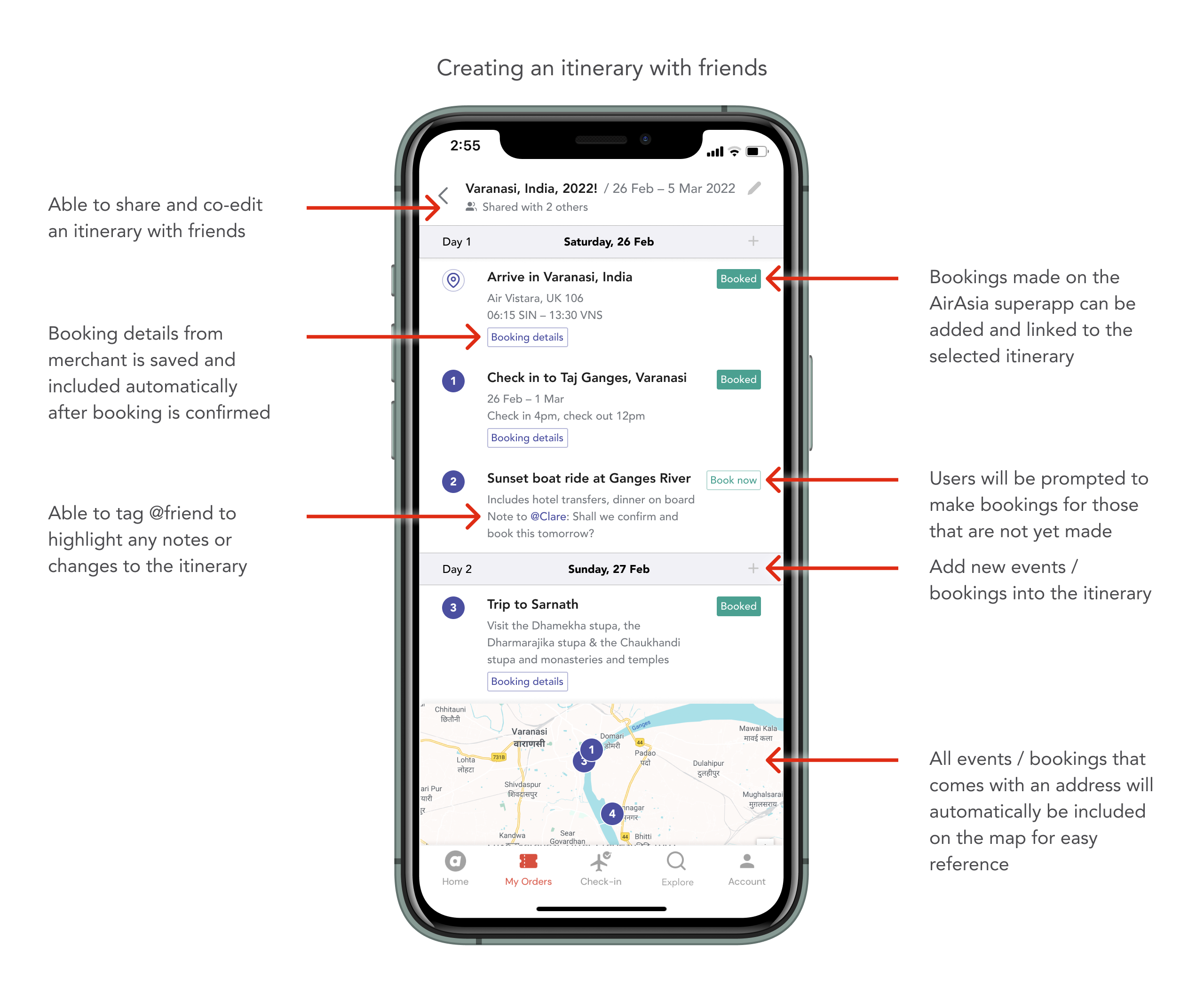
① Creating an itinerary on the super app alone or with friends
Co-owning an itinerary with friends allows everyone to edit the itinerary together and make bookings for the group easily.
② Easing the travel planning process: Adding parts of others’ itinerary to your own
Users can also select parts or the entire publicly-shared itinerary by others in the community, to add to their own. This speeds up the research process and makes it easy for travellers to plan!

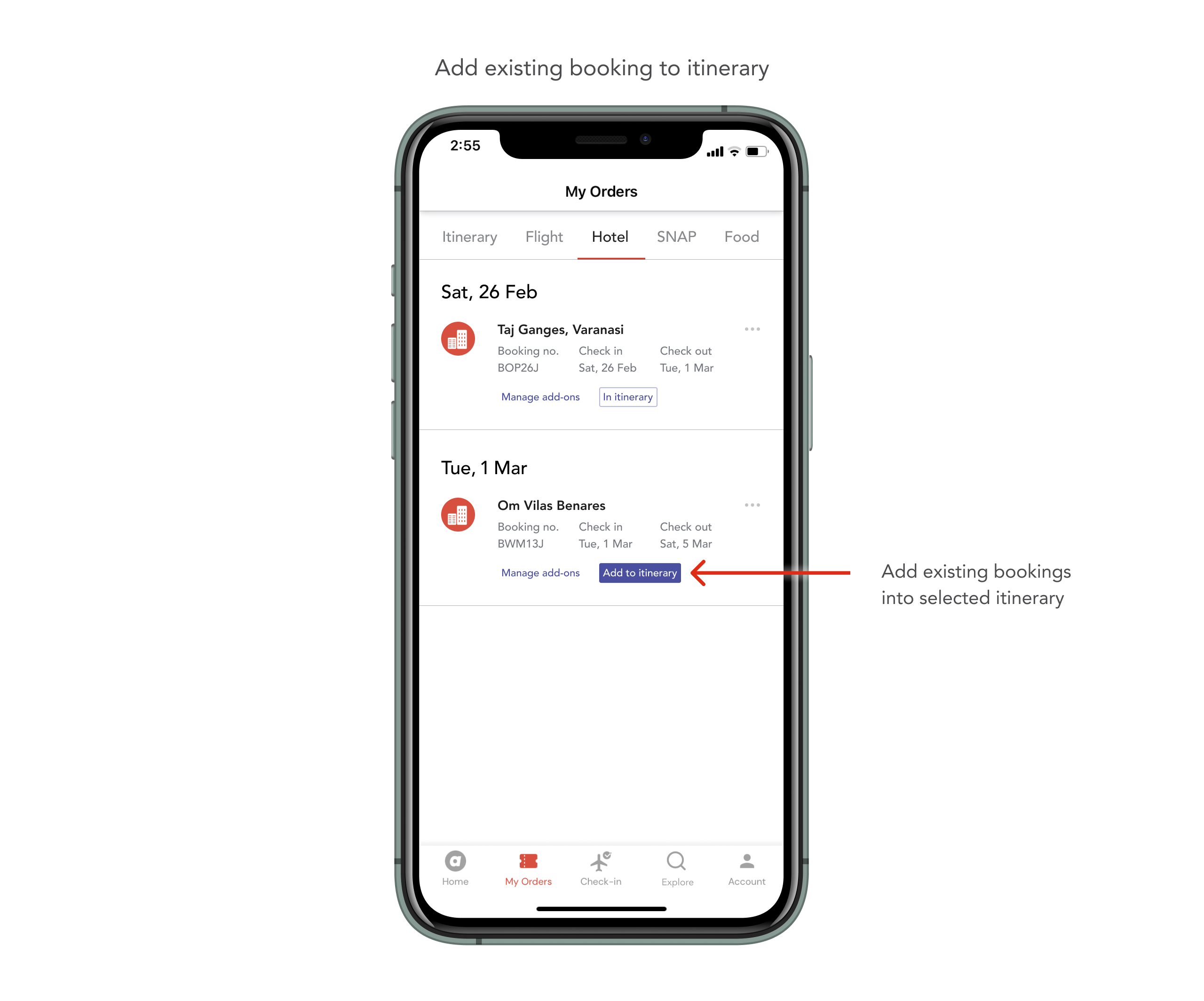
③ Easing the travel planning process: Add completed bookings to new / existing itinerary
This feature also considers other customer journey habits and allows users to book first and go on to create an itinerary and add bookings in it after.
④ Tapping on social media platform behavious: Like and comment on others’ itinerary
Having likes and comment features increases the interaction within the AirAsia app. Users are able to connect with one another, ask questions, give advices and like contributions by others on the itineraries.

⑤ B2B considerations: Subtle advertising and marketing for businesses
Itineraries can also be a subtle way for businesses to advertise. Promotions and offers will appear on users’ publicly-shared itinerary. As more users add in promoted hotels, flights, food establishments or services, it helps the businesses gain popularity and social presence on the platform over time.

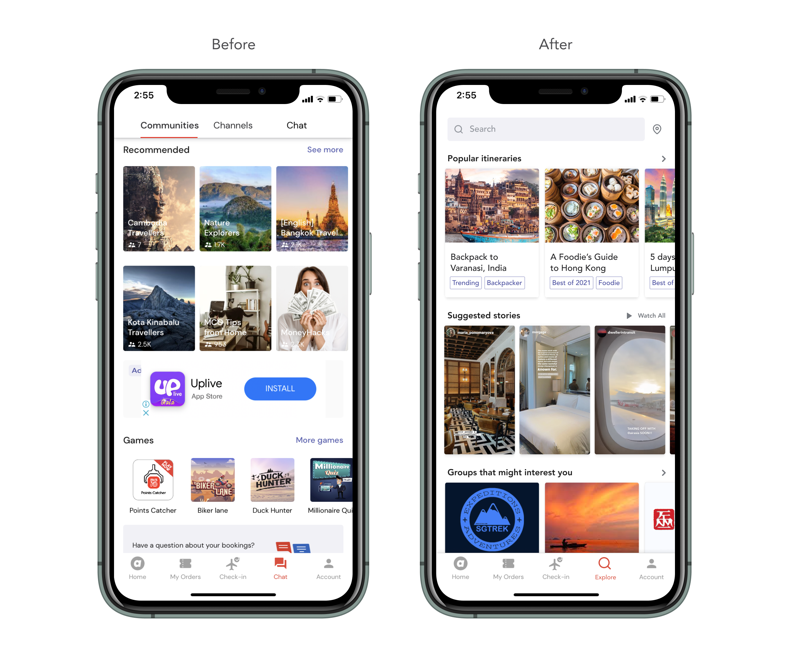
⑥ User-generated content and connections: Let users explore and discover what they like!
With the addition of user-generated contributions such as review-stories, Itineraries and groups, there will be a wealth of content on the super app. The Explore tab is a space for users to explore, discover, like and share what they are interested in.
Other details
If users find a group they want to join, they will be allowed to join the group (dependant on moderator’s rules). They can also receive alerts and push notifications from their groups.
A section of review-stories from friends and groups they follow can be suggested to the user on the Explore tab. Advertisements from businesses may also appear here, and will be in a more subtle format, as compared to the current ad placement.
Other details
︎︎︎ Search within the super app (and by location)
This makes it easier for users to find what they want easily. Tags within the search can be used to filter results. Users can also search by location since many travellers might want to get more information on the places they are wishing to travel to.︎︎︎ Allow users to create and join their own groups
This gives users the autonomy to manage their own interests, and also lets them use the super app to take note of current promotions that they can share readily within their own groups. The interconnectedness and constantly up-to-date information of their relevant interests will help them share information in their groups more readily.If users find a group they want to join, they will be allowed to join the group (dependant on moderator’s rules). They can also receive alerts and push notifications from their groups.
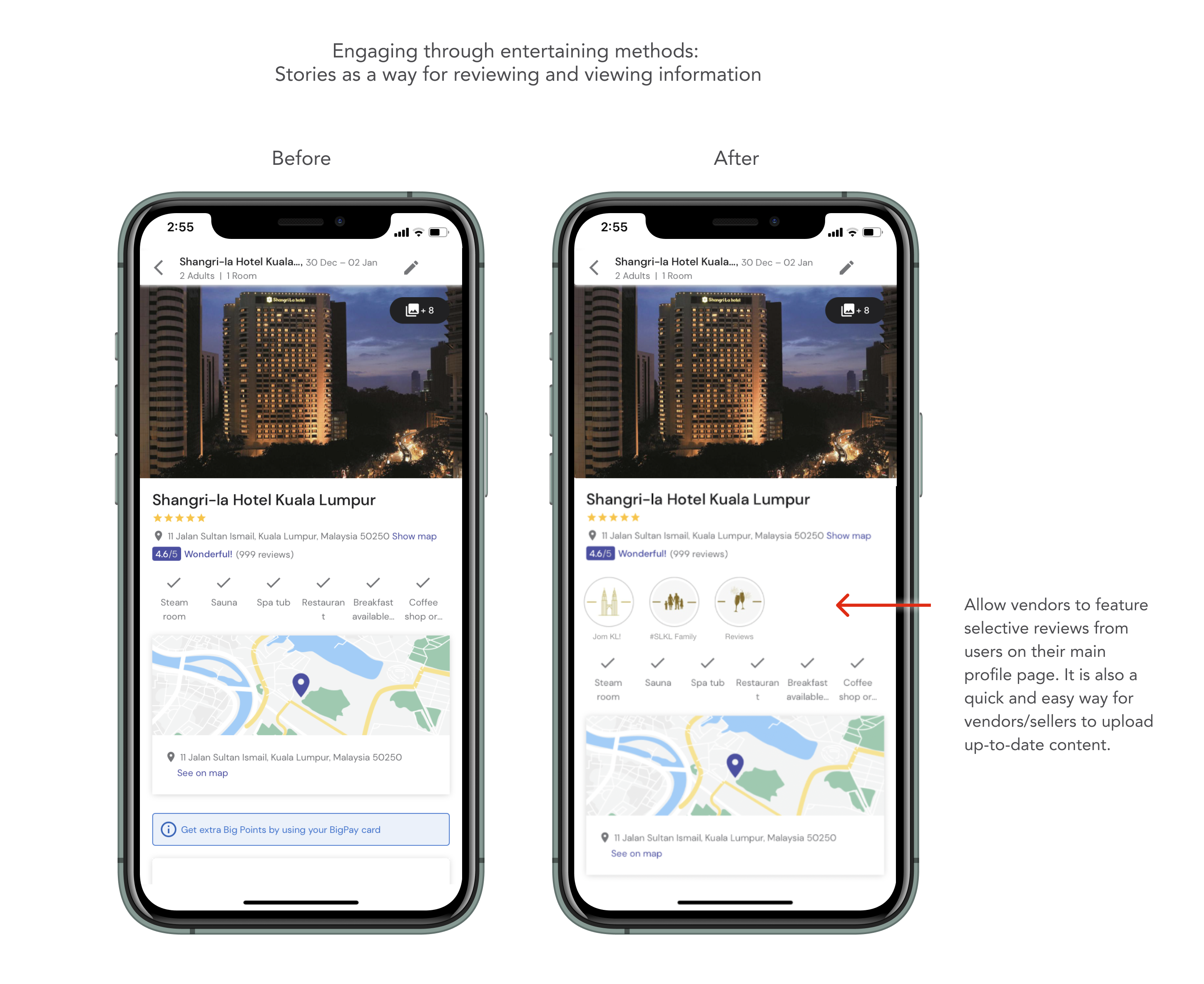
︎︎︎ Suggested stories (Stories as a method of reviewing and advertisement)
Include a new and entertaining way for the user to review products and services through short-videos—that have in-built text, filters, gifs capabilities. This feature takes inspiration from social media apps such as Instagram stories and TikTok. This allows for a more entertaining reviewing process, and the user might be more inclined to leave reviews as well.A section of review-stories from friends and groups they follow can be suggested to the user on the Explore tab. Advertisements from businesses may also appear here, and will be in a more subtle format, as compared to the current ad placement.
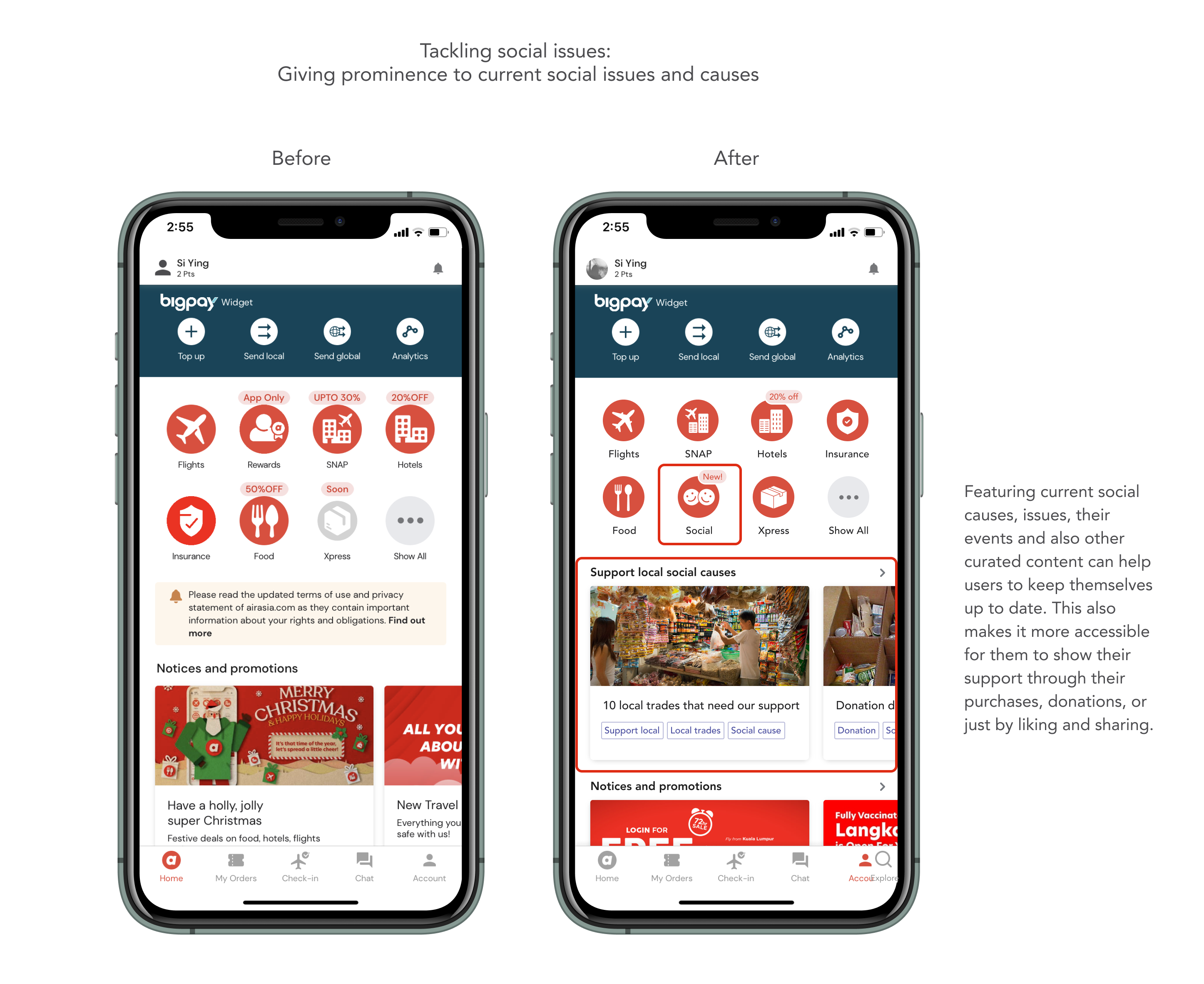
Other small features briefly explored

Steps forward, challenges and other thoughts
We were unable to test any of the ideas that we designed. Therefore, the extent of the ideas’ usefulness are unclear and unvalidated. Given more time, it would have been interesting to test and see if the features designed does indeed promote the product stance that were developed.
Most e-commerce platforms have a gamefied experience but does not yet have a social media aspect to them. This blend was something that I felt strongly about as a consumer/user, and would love to see it actually manifest someday!
Most e-commerce platforms have a gamefied experience but does not yet have a social media aspect to them. This blend was something that I felt strongly about as a consumer/user, and would love to see it actually manifest someday!
Project info
This project was done during my learning time at CuriousCore (Oct 2021 – Jan 2022). This project taught me a lot about strategy-making and planning, which is an integral part of any business. There was so much to think about and to do better, which explains why I went on to make further tweaks and revisions after the project ended, all of which are already reflected in this case study.